Story by Joe Pruett
Illustration by Symon Kudranski
Colors by Guy Major
Letters by Marshall Dillon
Cover by Francisco Francavilla
Published by Aftershock Comics
“It’s dark. You’re alone. Then there’s a knock. You open the door to find two seemingly normal kids. They ask to come in, to borrow your phone to call for a ride. You find yourself overcome with an intense fear that you can’t explain. And then you notice their eyes…black…SOLID black. You want to run, but now they’re inside. It’s too late. They have you.” -from the Aftershock website
Not much of a story description, which is probably the point. This new horror series from Aftershock Comics is going for mystery and tension. A very effective approach to horror, but one that, in this case, suffers from a lack of story.
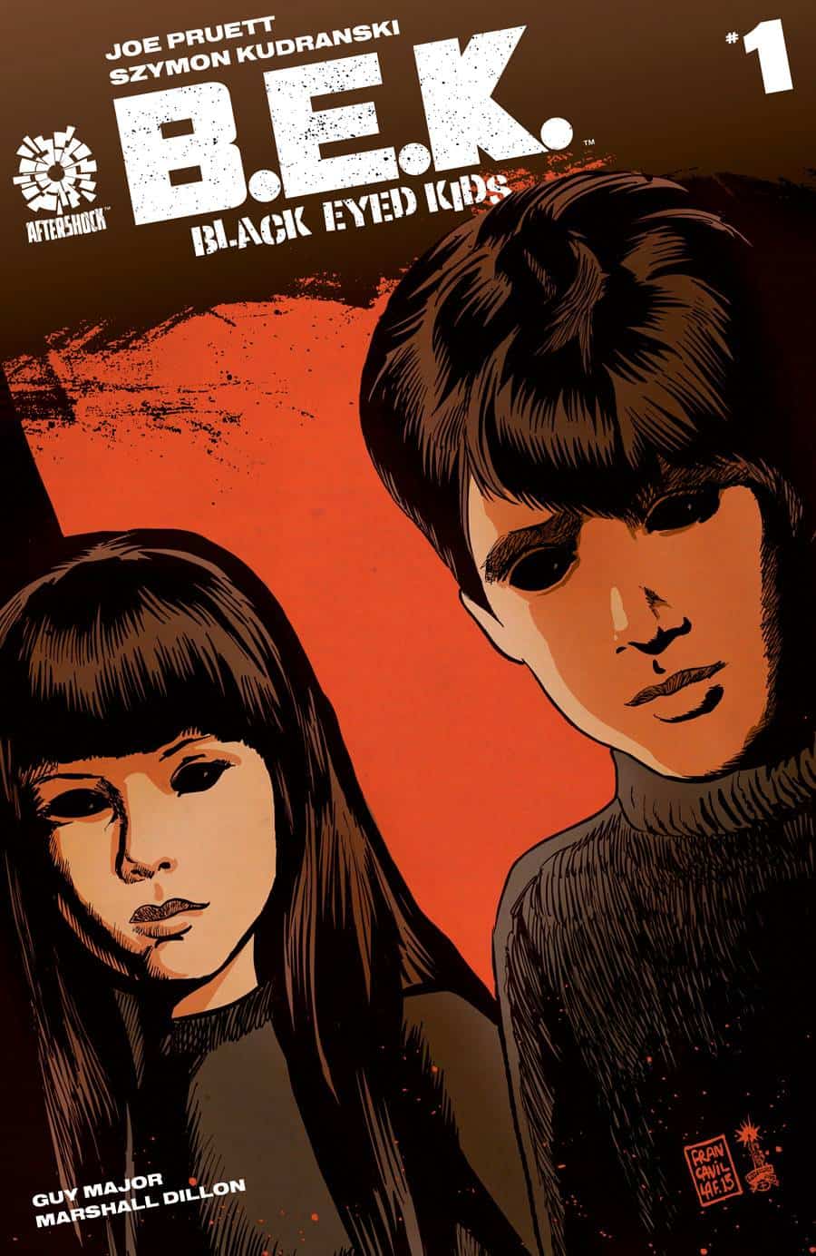
The cover by Francisco Francavilla is an eye-catcher. The extreme close-up of the two creepy children and the eerie orange highlight that washes over their faces creates a heightened sense of terror. For horror fans, the cover will remind one of the classic Village of the Damned, a movie also famous for its disturbing, weird-eyed children.
The logo is also well done. It’s kept at the top of the cover so as to not obscure the art. The only thing is that it’s bulky and in your face, contrary to the art’s subtle eeriness. It looks more like the logo of an action comic than a horror comic. Still, it’s a great cover and sure to attract potential readers.
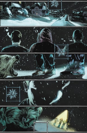
Initially, Symon Kudranski’s artwork is disappointing. It isn’t bad, just that it clashes with Francavilla’s. The former is like modern horror with its muted colors and photo-realism, while the latter is more aligned to classic horror with striking colors and expressionist illustration. That said, Kudranski’s art has a terrific atmosphere.
For example, the first page. The darkness of the area combined with the snow makes the scene  quiet, not a peaceful quite though; this is the calm before the storm, tension slowly crushing your shoulders and intuition telling you something horrible is coming. Enter the three children huddled together, their faces shrouded by darkness, and your spine tingles. They are the storm arrived, and the chaos they ensue is terrifying.
The only problem with this scene is the rigidness of the human figures. None of them seem to have natural movement. For this scene, it would have been more effective to drive home the tension the trio carries. Also, the snowflake is a pointless inclusion that adds nothing significant.
This dark atmosphere is throughout, making the reader freakout every time the trio is on panel. In this way, Kudranski’s art is quite effective. Also, Guy Major uses unique colors. A muted teal is used for the eerie night scenes previously described, but what’s more impressive are violent scenes. Downplaying the gore, Major heightens the tension by washing over characters with orange, red, and yellow. These colors have their own sense of violence which delivers more punch than if violence was shown in full detail.
Complimenting the art is Marshal Dillon’s lettering. Minuscule, chaotic lettering is used for atmosphere while bulky, large letters for violence. The combination of art, color, and lettering delivers horror that effectively switches back and forth between subtle and eerie, to violent and explosive. In this aspect, the art team has nailed the comic like a blade through flesh.
It’s too bad the story is lacking. The approach here is minimalist; Joe Pruett offers little in terms of backstory and explanation for what is going on. It works well for the black eyed kids, making one wonder what their motivations are. The unknown is the scariest thing of all.
Unfortunately, this same minimalism is applied to the characters. At least seven are introduced without giving much an impression of who they are, and only four of them seem dramatically significant. The story centers on Michael, a teenage boy interested in joining the B.E.Ks. A few scenes are dedicated to exploring Michael’s relationship to his family. It seems that Michael doesn’t get along with them. Stepdad shows no interest in raising him; Sister thinks he is a freak; only Mom seems to care, but Michael’s too hurt to accept her love.
This would all be great drama, except the pace of the comic doesn’t allow for these moments to leave an impression and, therefore, invest the reader to care about the characters. During the dramatic peak of the story, a moment that should really hit hard and either make the reader hate or pity Michael, they feel empty instead, like it should matter but it really doesn’t. If the comic had a more gradual pace, it might have. As is, the characters are cardboard.
This really hurts the story overall, especially the horror scenes. As well done as they are, the lack of emotional investment cuts down their effectiveness . Horror works best when there is concern for characters so when bad things happen to them, the reader gets hit hard like a hammer to the face. Even the most bloody, shocking scene will be ineffective without it.
Despite this problem, the story is still interesting. The mystery behind the black eyed kids remains intriguing. Pruett clearly has big plans, and finding out what those are is enough to keep readers invested. Whether or not their execution will be effective is yet to be seen.
While the first issue of Black Eyed Kids is far from satisfying, the dark, creepy art and mysterious intrigue of the story might be enough to keep readers invested. If the pacing problem can be figured out, the comic has the potential to be a unique series.


