Written by Hope Larson
Art by Brittney Williams
Colors by Sarah Stern
Letters by Jim Campbell
Published by BOOM! Studios
The BOOM! Box imprint at BOOM! Studios has spawned a variety of all ages books in different genres from fantasy (Lumberjanes) to slice of life (Giant Days) to science fiction with a wacky side (Midas Flesh) and finally romance with a wacky side (Jonesy). Next up on the docket is Goldie Vance #1, a teen detective story, written by Hope Larson (A Wrinkle in Time graphic novel) with art by Brittney Williams (the excellent Hellcat) and colors from Sarah Stern. The setup is reminiscient of the Nancy Drew novels with Goldie Vance solving mysteries while working for her dad with the help of her friends, but the cast of characters is much more diverse and the mysteries are much more clever. Goldie Vance #1 also deals with class issues through the lens of the detective genre much like the late, great television show Veronica Mars although its tone is a lighter, and the setting is a retro-ish Florida hotel called Crossed Palms and not Southern California.
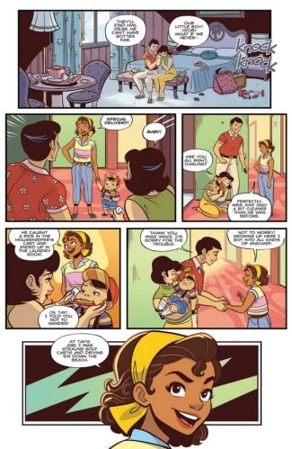
And one of the strengths of Goldie Vance #1 is how lived in its world feels as Larson and Williams dump the reader right into the middle of one of Goldie’s mysteries. It’s not a high stakes one as she finds one of the hotel guest’s missing kids, but it does an effective job introducing the seemingly idyllic setting of Crossed Palms (People still complain about the humidity as usual.), the wealth of its guests, and Goldie’s relationships with Cheryl, the front desk worker and Rob, her fellow valet parker. Larson also does a little subversion of romantic tropes by having Rob be defined mainly by his love for Cheryl in the first issue while having Cheryl mostly care about being an astronaut. (Rob does like to drag race cars though and so does Goldie.) Later, in the issue, they introduce another member of Goldie’s supporting cast, the adorkable Walt, who is measured and professional about his detective work just like  Goldie is upbeat about hers. However, he does have his moments of insight, like saying that it was probably a hotel worker and not a guest, who stole an eccentric guest named Ludwig’s “priceless” necklace, because it took a lot of “effort”, which is something the silver spoon sporting clientele of Crossed Palms don’t have to worry about. Larson and Williams also leave the necklace mystery partially unresolved to hook readers for the next issue.
Goldie Vance #1 is also proof that detective or mystery stories don’t have to wallow in the shadows. Colorist Sarah Stern uses plenty of pastels in the backgrounds as well as the clothes the characters wear because the setting is quite tropical. Gold and yellow are the main colors of the issue, which makes sense because of the character’s name as well as the beautiful necklace she and Walt are trying to retrieve. On the art front, Brittney Williams brings her bright, animation-influenced style to the comic, and it matches Goldie’s flat out enthusiasm about everything from talking to potential suspects to street racing or even giving Rob romantic advice. Williams uses the classic tools of cartooning, like sweat drops, speed lines, and even good ol’ cloud breath, to quickly show a feeling or story beat and move on at a zippy pace. But she can be stylish too as exhibited by the thrilling race between Goldie and Rob’s rival, Skunk (Who has a literal white skunk stripe in his hair.) to win back the necklace he stole, which is filled with high stakes suspense and easy to follow despite the changes in panel structure. It’s like Fast and Furious, but with classic cars, a 1950s fashion aesthetic, and character models that scream adorable.
Goldie Vance #1 is rooted in the teen detective genre, but Hope Larson and Brittney Williams put their own spin on it through their charming setting and a sparkling cast of characters. Goldie also has an interesting moral compass in that she will not just bend, but break rules to help solve a case, like flat out stealing a hotel guest’s car to win the necklace back. All in all, the comic is a really fun read with energetic art, staccato dialogue, and several hooks that will have you pre-ordering the rest of this four issue miniseries.


