The X-Men franchise is actually the oldest one still active in the superhero movie genre, having first debuted on screen all the way back in 2000. In 16 years on screen, the franchise has gone through a number of changes, and in more ways than one you can chart a history of many of the trends the superhero movie genre has gone through just by looking at the X-Men movies. Of all the ways the series has changed and…well, mutated over the years, one of the most interesting to look at is the costumes. Since that first movie, numerous attempts have been made to create an iconic look for the mutant super-team, with various degrees of success. From the black leather jumpsuits of the first movie, to the more colorful uniforms of X-Men First Class, to the armored combat suits already featuring heavily in the advertising for X-Men Apocalypse, the team’s look has changed quite a bit over the years.
X-Men (2000), Costume Designer: Louise Mingenbach
In those first years of the big-screen superhero movie, it felt like no one really knew what superheroes should look like on screen, but they knew what they shouldn’t look like….
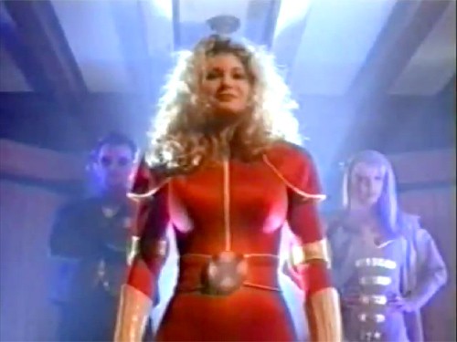
This is actually a still from a TV pilot for Generation X, a would-be Fox series charting the adventures of a young team of X-Men. The uniform above was only featured in one scene, displayed proudly at the end of the pilot. It’s a valiant effort at bringing an X-Men uniform to the screen, bold and colorful and unmistakably “superhero-y”. But it also kinda looks like a Halloween costume, kinda cheap and chintzy and let’s be honest: pretty silly.
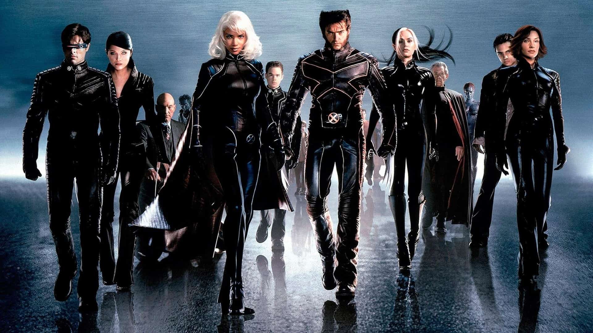
While the design team of the first X-Men movie may or may not have even been aware of the old Generation X pilot (it only aired the once on Fox as far as I can remember), this kind of look is still what they were trying to avoid in designing the suits for the team’s big-screen debut. There are a lot of routes they could have gone in trying to make the X-Men look less like cosplayers and more like a super-powered force to be reckoned with, but in the year 2000, the most obvious choice was evidently to wrap their players in head to toe black leather. It may seem like an odd choice now, but remember that these were the post-Matrix, pre-Matrix Revolution days. Leather was in.
So when Hugh Jackman, Halle Berry and others suited up for the film, they looked like this:
In the far-flung future of 2016, it’s somewhat hard to look at these first suits and not see them as a bit anachronistic. They look incredibly hard to move in, and one can only imagine the discomfort and heat endured by actually being squeezed into one of the things. And while the film itself famously quipped “what would you prefer, yellow spandex?”, implying that these suits were less patently ridiculous than what the team typically wore in the comics, that brazen confidence seems misplaced by now. Are the black leather onesies less silly than Jackman swaggering around in Wolverine’s iconic yellow duds would have been? Only marginally, if we’re being honest about it.
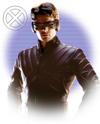
The suits from the first movie feel very much like a first attempt, an experimental stab at what superheroes should look like in movies. The next two movies in the first trilogy would essentially run with this look, with some minor refinements.
As anachronistic as they might feel now, it’s important to view the suits of the first film, and the two that followed, as a product of their time. There’s the Matrix influences, as already mentioned, but also Blade just the previous year. Every successful superhero film in recent memory had gone the dark route, visually. The only real attempt at a spandex-clad crimefighter dressed in something other than black, or very dark, colors was The Phantom. And can you blame Fox and Bryan Singer for not wanting to make something akin to The Phantom?
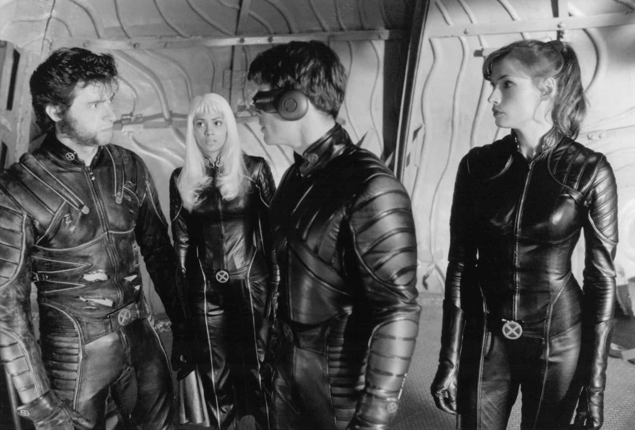
X2: X-Men United (2003) Costume Designer: Louise Mingenbach
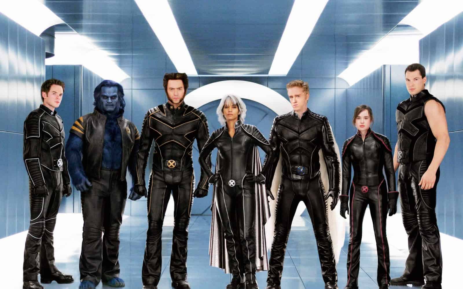
X-Men: The Last Stand (2006) Costume Designers: Lisa Tomczeszyn and Judianna Makovsky
You wouldn’t be blamed for thinking that the costumes for all three of the first X-Men movies are identical, but a close examination reveals that this isn’t actually the case.
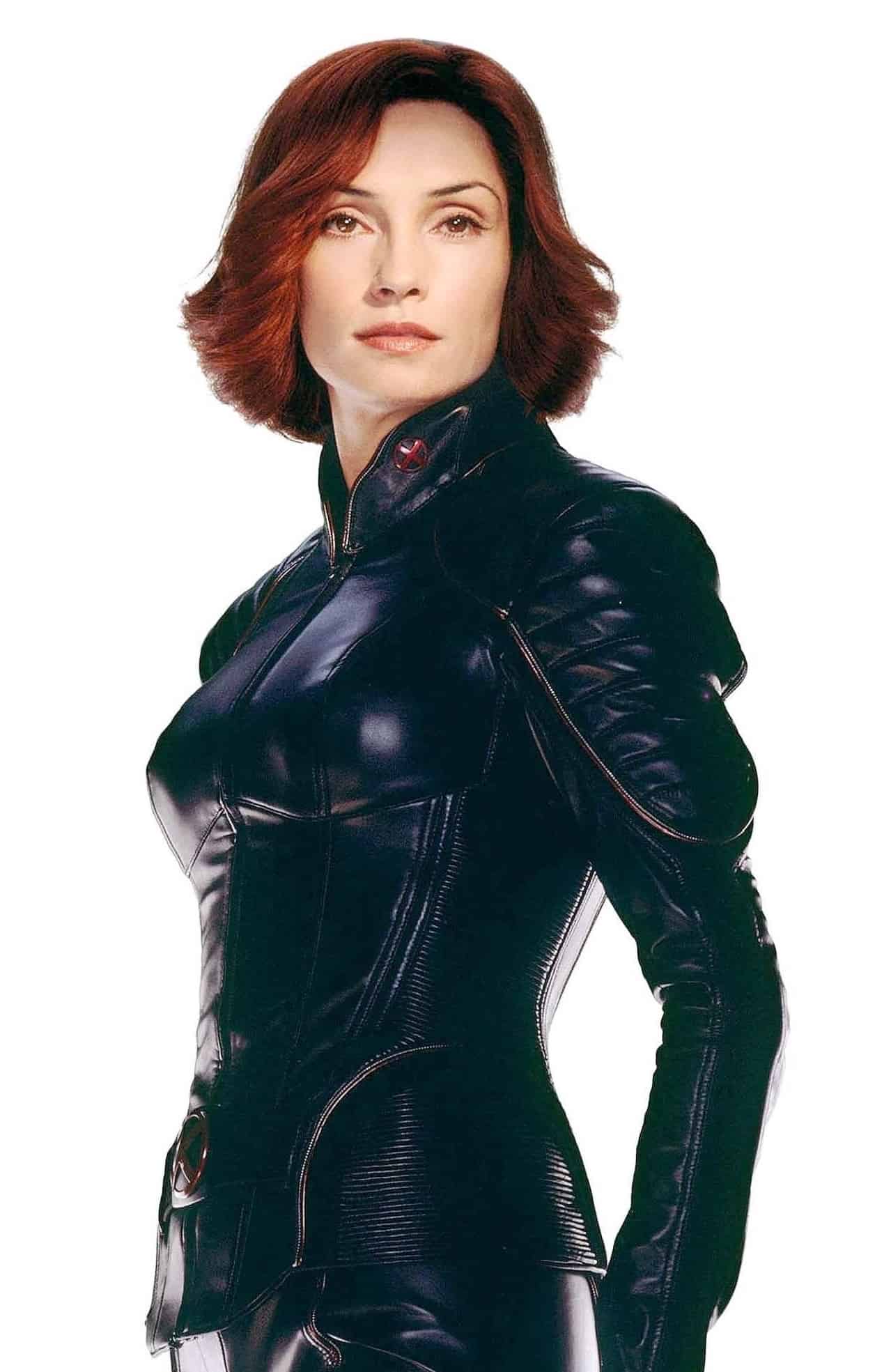 While in the first movie the entire team had to endure one-piece jumpsuits, the costumes in 2 and 3 are actually mostly jacket and pants combos, which probably made them considerably more comfortable and easy to take on and off. That is, for everyone but Storm, who has to wear the same jumpsuit for all three installments of the first trilogy.
Jean Grey actually gets one upgrade, albeit a barely noticeable one. Her suit now features some very slight red highlights, a visual foreshadowing of her Phoenix transformation.
When you look closely, things are over all a bit less form-fitting in X2, with some room added to the sleeves and pants.
The much-maligned X-Men: The Last Stand saw the introduction of a host of new characters, and with them came the most variation among uniform designs seen in the movies up to that point. Colossus has an appropriately sleeveless uniform, Shadowcat some bright red piping, and Beast an open, short-sleeved jacket with some orange slashes on the shoulders.
With the disastrous reception of The Last Stand, though, it became apparent that the franchise would need to take a turn and re-invent itself, and the visuals for the next film in the core series would do just that.
X-Men: First Class (2011) Costume Designer: Sammy Sheldon
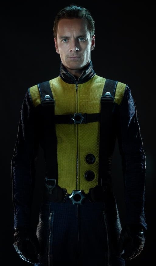
Say what you will about Mattew Vaughn, he isn’t afraid of color. X-Men: First Class was a radical shift away from the aesthetics of the first trilogy, less gritty and dark and far more lively and colorful. Gone were the biker jackets and predominantly black color scheme, replaced by bright blues and yellows and actual fabrics rather than leather.
The uniform is now a two piece jacket and pants, mixing dark blue for the pants and sleeves with a bright block of yellow on the torso and shoulders. The outfits strike a nice balance between utilitarian and stylish, with a flight harness and some valves of some sort on the torso. They convey the idea of the team as a search and rescue group rather nicely while still adding some style to the mix with the bright colors. Sadly, there are no X-logos to be seen, however.
Each team member gets a bit of variation, generally just enough to keep things interesting. Banshee’s uniform has some black vertical lines on the chest, for example. There’s also just enough detail in the texturing on the suits that things stay interesting when viewed up close, but not so much detail that it becomes distracting or messy looking.
The First Class costumes are among the most faithful to any previously existing source material in the history of on-screen X-Men uniforms. Specifically, the suits from the comic of the same name, which are in turn modeled off of the team’s first uniforms, the basic design of which has appeared on “in-training” members of the team ever since, either in blue-and-yellow or black-and-yellow.
The bright colors and fabrics of X-Men First Class felt like a new chapter, and a sign that the X-Men franchise was starting to embrace trends seen in other superhero franchises making it big at the box office at the time. Marvel Studios was midway through its “first wave” when First Class was released, and comic book movies were starting to get more comfortable in their own skin, embracing a bit more of the color and (visual and thematic) lightheartedness of their source material. It felt like comic book movies were getting more comfortable being comic book movies, and weren’t so nervous about being seen as fun, garish entertainment. Which isn’t to say they were getting dumb, but rather that they were learning to walk a line between the seriousness and playfulness. If nothing else, the costumes in First Class felt like a biproduct of this change in approach. For once, the X-Men looked more or less like the X-Men, and that was kind of exciting.
But rather than continue with the franchise, director Vaughn left the director’s chair, leading to the return of Bryan Singer. Because of this, First Class feels like a tangent in the series, visually. Vaughn’s brighter, almost exaggerated visual style left with him, with Singer’s darker visuals.
Fortunately, this didn’t entirely mean a return to the mostly-black leather X-uniforms of old. At least…not entirely.
X-Men: Days of Future Past (2014) Costume Designer: Louise Mingenbach
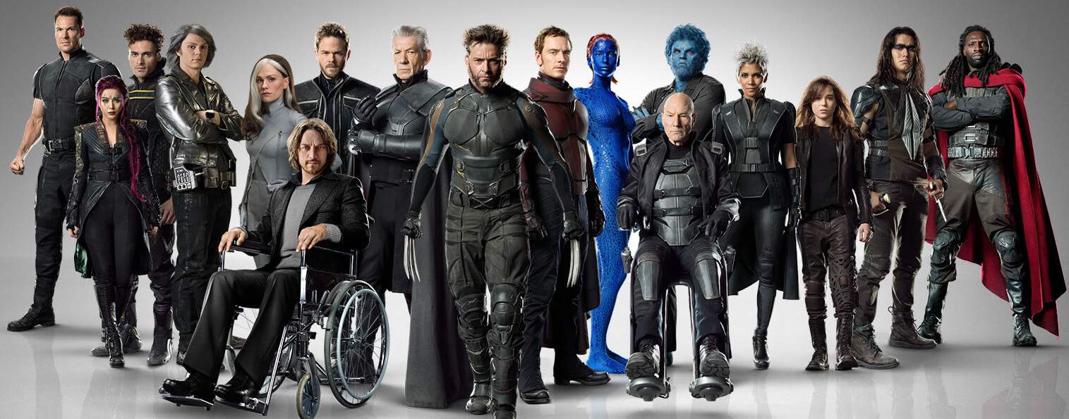
The uniforms of X-Men: Days of Future Past are really the definition of a mixed bag, and appropriately so. While in the context of the previous films the uniforms the team wore were presumably custom-made suits, the team of the dark future of Days of Future Past presumably had to scavenge much of their gear, repairing it over time and cobbling it together from whatever they could find. And the designs somewhat reflect this idea, with very little in the way of a unified aesthetic beyond a lot of black. Of course, this isn’t universal. There are indications that a lot of what we see the team wearing were once custom-made uniforms, but they’ve been mixed in with scavenged elements here and there, like dusty looking combat boots, baggy military pants and one or two pieces of mismatched armor.
So there’s a lot of variation, which is good. But the problem is that when you look at each costume individually, they often feel like an odd mix of bland and over-detailed. Take a look at Wolverine’s outfit for example. His costume actually contains touches of blue and yellow, the first time he’s ever sported anything close to his classic colors on screen. But his uniform also feels like a hodgepodge of design elements. Buckles here, straps there, layers upon layers and at least three different textures liberally mingled and all competing for the eye’s attention. There’s nothing about the suit that really catches the attention, and it becomes kind of a blur of detail whenever it’s in motion.
Other costumes, like the ones seen on Storm, Professor X or Magneto just feel like painfully generic black sci-fi armor, like they’re wearing that Starship Troopers armor that pops up in low-budget sci-fi every now and again.
By design or not, nothing really stands out about the uniforms in Days of Future Past. While the varied costumes adequately get across that the team is now a scrappy band of guerrilla freedom fighters, they also mostly lack anything close to iconic or memorable in their design. It’s not just that they’re all black, it’s that they’re just….there. They fulfill the contextual needs placed on them, but when it comes to creating a memorable array of visual designs and aesthetics, they fall somewhat short.
While things in the core X-Men franchise would appear to be continuing down this path, a recent spinoff provided audiences and costume enthusiasts with an unexpected reprieve.
Deadpool (2016) Costume Designer: Angus Strathie
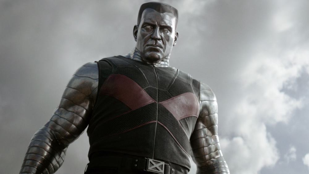
It’s funny how this year’s X-Men spinoff Deadpool only featured a pair of actual team members, and yet somehow managed to blow almost every previous X-Men movie out of the water in terms of costume design. In the same way that Deadpool himself looks unmistakably like Deadpool, the film’s X-Men supporting characters are both instantly recognizable as members of the team. In the case of Colossus, this admittedly mostly comes from the character design itself, from the metallic bands enveloping his body to the big Ivan Drago style flat-top hairdo. His actual costume, while pretty good, still feels somewhat standard-issue when it comes to on-screen X-Men suits: mostly black and a bit featureless besides some (very welcome) red sections. But Colossus wasn’t the only card-carrying X-Man to appear in Deadpool.
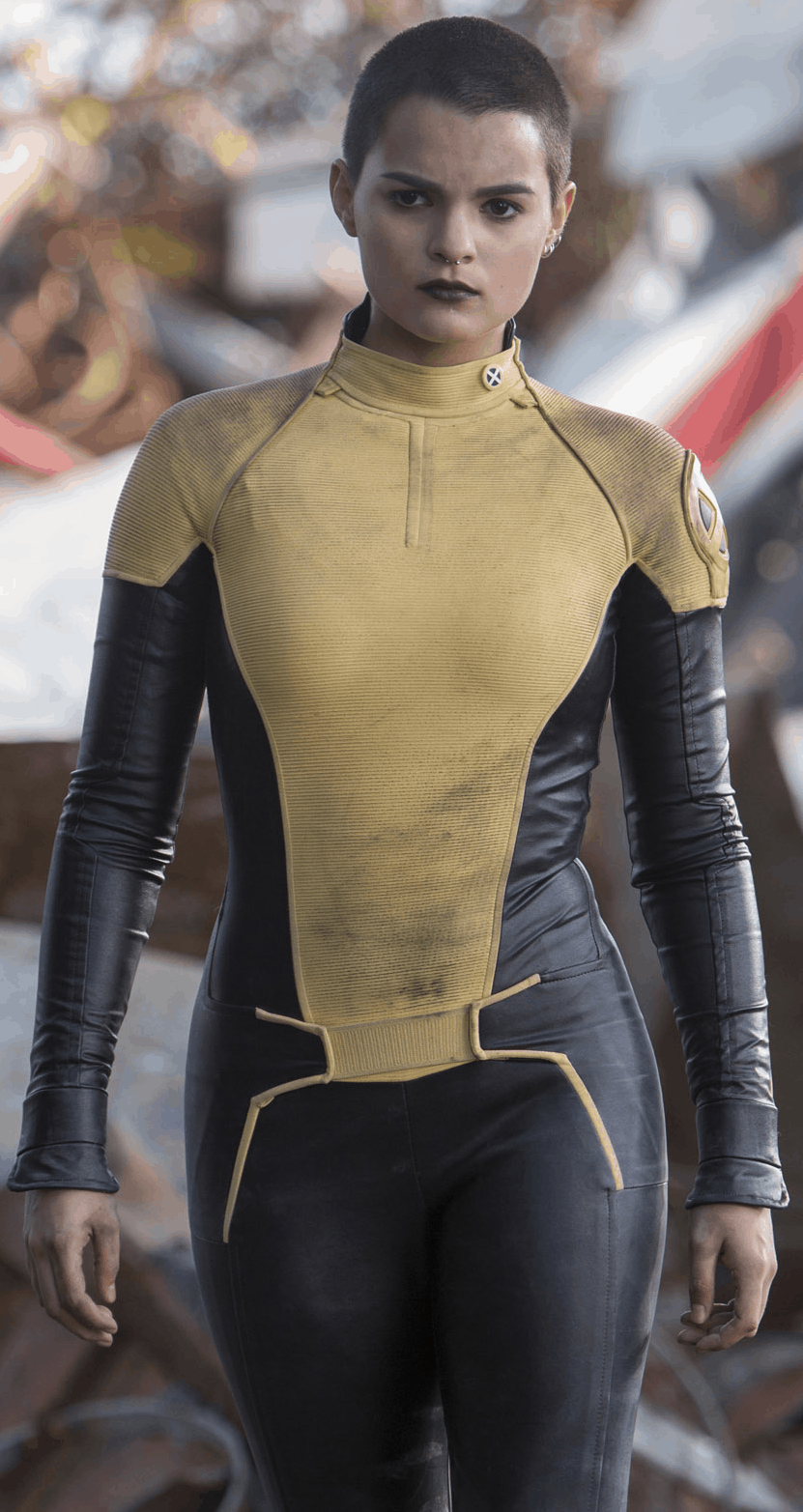 Like the suits from First Class, the outfit worn by Colossus’ charge, Negasonic Teenage Warhead, is a callback to the “in training” outfits seen in the early comics, and later on teams like the New Mutants. And it looks fantastic. Negasonic’s suit is a one-piece yellow-and-black uniform that beautifully rides the line between looking unmistakably like an X-Men uniform while still coming across as durable and battle-ready. There’s a loud, proud X-logo on the shoulder and another on the collar, and the yellow is just the right hue, not too dull and not too bright. The yellow sections of the suit actually do have some texturing, but it’s so slight that you’d only really notice it in closeups or high-res photographs. The black parts, like the sleeves and legs, have a smooth, leathery sheen to them that catches the light well, and the two textures are kept separate and distinct so that they work together and complement one another rather than compete for our attention. There’s just enough detail like seam lines and piping that it’s visually interesting from multiple angles, but not so much that the design becomes visually busy, like Wolverine’s Days of Future Past uniform.
It’s really a phenomenal piece of costume design, and a full team of X-Men in suits like this would be any X-fan’s dream come true.
We can only hope that more X-Men make an appearance in the inevitable Deadpool sequel, or that designer Angus Strathie is brought on board for future X-Men movies in the main series. Because while Deadpool showed us what a fantastic X-uniform can look like on screen, the next installment in the franchise looks to be going a different route…..
X-Men: Apocalypse (2016) Costume Designer: Louise Mingenbach
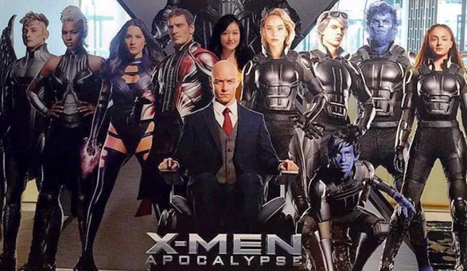
It’s entirely possible that the jet-black armored uniforms seen in much of the advertising for X-Men Apocalypse, the upcoming installment in the franchise, won’t be the only uniforms the team will be seen wearing in the film. Bryan Singer hinted during a Yahoo Q&A that we “may get a chance” at seeing more traditional looking uniforms. While there’s been no evidence of this just yet, indicating that Singer and Mingenbach decided not to go that route, the film may do something like close on an epic shot of the team in a new set of uniforms, like how First Class ended on a shot of Michael Fassbender in a more traditional (though not very great looking) Magneto costume.
But given their ubiquity in all the advertising, the black suits are probably what the team will be wearing for the majority of Apocalypse, and given that they’re the most thunderously dull costumes in the history of the film franchise, that’s a pretty bad thing.
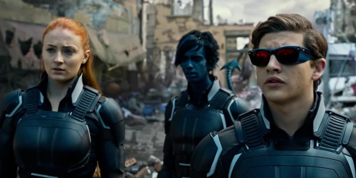
The new uniform for Apocalypse is a simple black unitard with some (possibly) tan along the arms that you could miss pretty easily. Over top of this are various pieces of shiny, plastic-y looking black armor pieces, most notably chest plates. Variation among team members is nil, except for a pair of goggles for Quicksilver and slightly different sized chestplates.
While admittedly the new uniforms don’t go the over-detailed route, they’re also just…..dull. There’s no flair to them, nothing that grabs the eye. There’s no color at all, and nary an X-logo to be seen anywhere. There’s nothing about them that makes you think “X-Men”. Cyclops doesn’t even have a visor, unless they’re saving that for a final shot or climactic sequence as well. When you think about it, the bulkier looking suits don’t even look like they’d make sense for half of the characters wearing them. Why would Mystique, Nightcrawler, Beast and Quicksilver, four characters whose powers and combat styles that rely heavily on speed and agility, go into combat wearing somewhat restrictive looking armored chestplates? Wouldn’t something lighter and more mobile-looking suit their abilities more?
If Psylocke can wear the same one-piece purple swimsuit in the film that she does so often in the comics, why is the team restricted to these dull-as-dishwater outfits? Why does Magneto get some red in his outfit (granted, red mixed too busily with blacks and silvers) but the team are restricted to black?
The jury may still be out on the movie itself, but the suits we’ve seen so far for the core team in Apocalypse are doubtlessly the worst in the entire franchise, dull and graceless across the board. We can only hope that future filmmakers and costume designers take notes from Deadpool rather than Apocalypse when it comes to costume design.
With the runaway success of Deadpool, X-Men Apocalypse would have to do abysmally bad to keep the franchise from continuing beyond the next film, at least at Fox. How the team’s on-screen look will evolve for future installments is anyone’s guess. But hopefully future costume designers take note of what came before, building on the successes and failures of their predecessors.

