
Welcome back, scumbags! We’ve got another two-parter today. Yeah, yeah, I know. It’s a pain in the butt, but when I got a lot to say about a comic, I gotta split it up (blame my evil editors).
Before I begin, let’s clarify a few things about this column. First off, I will admit that all of the comics I review are from the creators that wanted a review. I don’t search for these babies myself. I bring this up because it’s important to know the purpose of Hive of Scum: to be critical and helpful. As a reviewer, it is my job to be honest if a comic is good or not. I’ll even make salty jokes pointing out the flaws. However, I will never downright hate a comic. I don’t want to discourage a creator from making comics but show them where they need to improve. If you’re a potential reader, don’t think my review is meant to convince you not to read a comic. Even if I find a lot of flaws, I encourage you to give it a read and supply the creator with feedback. I consider these creators to be friends of mine. They’re a community I’m proud to be part of, and I want to give back to them through constructive criticism. We’re all small fish in this ocean called comics. Instead of eating ourselves alive, let’s help each other grow into leviathans.
Now, with that little bit of PSA out of the way, let’s get on with the review!
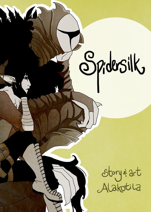
Imagine if you will two soldiers, half-human/half-elf Prentice and half-human/half goblin Orestes. Imagine them on the run and hiding in a small medieval city called Kalviva. Imagine these soldiers finding the mercenary life hard and boring. I mean, how many times can people lose their slippers? One day, Prentice has a chance encounter with Sohrab who invites him to join the Orbweavers, a group that’s part of Kalviva’s clandestine thieves’ guild. Prentice and Orestes are quickly accepted into the guild and enjoy assignments from high-paying employers, protection from the guards, and a group of new friends and lovers. It seems like an ideal life, until a rival gang of thieves moves in on their turf. They want to wipe out the thieves’ guild and take over Kalviva. Now, the two ex-soldiers must protect their friends and risk revealing their sordid past. Welcome to Spidersilk, a slice-of-life fantasy comic with thieving, swordplay, and romcom from writer and artist Pamela Kotila.
The Art
 The art is a mixed bag, most noticeably with colors. Sometimes, when one sees the difference between a piece of art when it’s colored or black and white, they can notice a change in quality. Either it’s better or worse. Spidersilk is formatted to be like a manga where the
 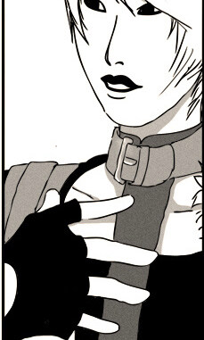 first page or two has color and the proceeding pages are all black and white. Pam is obviously familiar with manga and knows how to format her comic to the medium’s specifics. Unfortunately, this is where one can notice a huge difference in art quality.
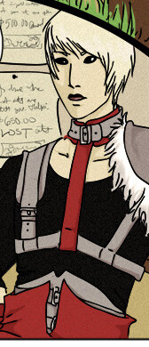
I find that the colored art is superior. In the chapter covers, characters are dressed in stylized, colorful clothing with unique skin tones and hair color. and they strike dynamic poses and look animated. The comic pages with color look fleshed out and detailed. When the comic changes to black and white, the art looks flat and stiff. When reading the comic for the first time, I looked at the colored art and thought, “Oh, hey! This is pretty good!” Then when I got to the black and white parts it turned into “Oh crap! It’s high school art class all over again!” That’s when I noticed that it wasn’t the lack of color that diminished the art, but the art itself.
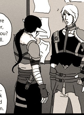

While clothing and hairstyles are fine, character anatomy isn’t good. It’s not very detailed and characters often look flat. Limbs change shapes and sizes from panel to panel or are twisted in weird angles. The eyes, while most of the time okay, can sometimes look loopy or spaced out as though the characters are tripping balls. If the character is actually high, fine and dandy, but to look like that constantly might be cause for some concern and I don’t think they’ve invented sunglasses yet. Spidersilk‘s characters remind me of high school art. They’re not bad, but they hardly look professional and need improvement.
 “So, maybe adding color will help out” you say. Well, yes the color does improve the art, but only because the flaws are less noticeable. This should never be the reason why you use color. Comic art should look good either with or without it. Just take a look at Jeff Smith’s stuff. It’s always stellar and whether you like the colored or black and white version is a matter of personal preference. The color is meant to amplify what is already good art and never a band aid for flaws. This doesn’t mean that Pam Kotila’s a bad artist. If you go on her website and check out some of her pieces, you’ll find that she is highly talented. However, I feel as though because Spidersilk is a webcomic, she has to use a looser style. This is true of all comic art. It’s less time consuming and makes for better sequential storytelling. That doesn’t mean it has to be of less quality. I suggest Pam tighten up anatomy, give character’s more details, and draw them in a way that’s animated so they don’t look stiff and flat. Also, don’t forget those environments. I ain’t expecting Claude Monet, but I’d like more than a few squiggles in the background.
Another thing I like about the comic is its sequential storytelling. One of the advantages to manga is that readers are gradually introduced to the world and characters. They get to look at the art, get to know the feel and imagery of everything. The reader feels like they’ve been given access to the world, allowed to live in it instead of shown only snapshots. They’re being absorbed into the story of the comic.
Pam demonstrates this gradual storytelling in Spidersilk very well, but it’s muddled with errors  that keep it from being truly absorbing. One is the flawed art. For example, the stiffness of the characters makes their movement awkward. I like it when characters look animated because it feels natural. When they look stiff, they’re unnatural which is off-putting. Also, panel transition feels unnatural because characters don’t look like they’re going from one scene to the next organically . These kind of flaws in the art can be distracting and prevent the reader from absorbing themselves in the story. Less critical readers might not be concerned, but it’s still a problem. The only solution is to draw the characters better.
Second, the panels feel claustrophobic with too many close-ups of the characters. It leaves little room for environments. The lack of environments takes away from absorption. It’s like I’m being denied access to the world. I need to see everything about it: the sky, the grass, the pee-flecked toilet seats (or chamber pots since this is medieval times). Characters aren’t enough. I mean, sure they’ve got some pretty mugs, but I’d like to see what kinda forks they use too! Admittedly, this is probably just me. Looking back through some panels, I see more objects than I did before. I’ll leave the reader to decide.
What might actually be the source of claustrophobia are all the words. There a ton of dialogue bubbles and text captions in this comic, and it’s too much. If you go back and read some older comics, you might find them a burden: Needless descriptions of scenes, descriptions of character emotions, that kind of thing. While these aren’t the writing issues for Spidersilk, a lot more is said than needed, and I would advice Pam go back and figure out what she can cut out. I’ll go more into this once I get to the writing section.
You’re probably tired of me being a jerk off about the art. Don’t worry, I just got two more gripes, then you can move on to reading something better.
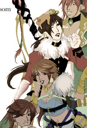 While I’ve praised the characters for being uniquely designed, they suffer from that most dreaded of art flaws: SAME FACE SYNDROME! AAAAAAAH! This is a problem because if characters have similar faces, the reader can confuse them. I got so many characters confused because of this and I had to find their names to remind myself of who was who. This problem is easy to fix just by giving characters more distinct facial features and body types.
Also, the Ambassador, while I find him cool looking, can be seen as funny instead of scary. I mean, he’s a bird dressed as a ninja. Even though he is in comedic moments that offset his scariness, it might do good to make him a bit scarier. Just throw some crosshatches on his face. Works for Liefeld (note: don’t actually do that because it’s the work of hacks).
Finally, some word balloons are placed incorrectly. Either they are placed next to a character who is obviously not speaking or they’re put in separate panels from the speaker. It looks weird, so Pam should place them correctly.
Whew! That’s it for this week, scumbags. I’m done griping endlessly about the art. Come back next week and watch as I gripe endlessly about the writing. Until next week, stay filthy my friends!
Read the comic here.
Support the comic’s Kickstarter.
Check out Pam’s website.
Follow Pam on Twitter.